Cards
Purpose
Cards are used to group related content, such as projects, blog posts, and other information. They should not be used together to display content that is not meant to be displayed together in the same section.
Example
See the Pen Cards by Johanna (@jsneedhi) on CodePen.
Code
Usage
- Do not put too much content on the card, a maximum of 4 lines of content should be displayed.
- Maintain consistency in the layout and design of cards throughout the website for a cohesive user experience.
- Use responsive design principles to ensure cards adapt to different screen sizes and devices.
Accessibility Considerations
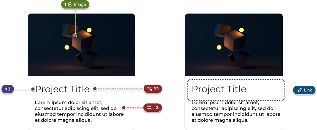
- Use proper heading styles so users can navigate using a keyboard or other assistive device.
- Cards should be focusable and interactive using common keyboard shortcuts
- Use ARIA attributes
- Include alt text on all images
- Maintain good color contrast between text and background elements for best readability